./web/divs/readme.txt
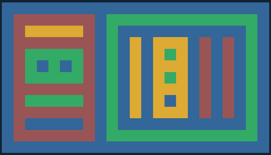
This picture is made entirely of empty div's with the style property : "display : flex;", turning them into what is called a flex-box.

Modern HTML layouts use flex-boxes heavily because they solve a lot of the difficulties that float elements caused over decades of web development. Flex-boxes are the answer to most layout questions, scale well to small screens, and make it very easy to keep elements centered, aligned, and well-balanced. Flex-boxes can be set to align their elements in rows or in columns with the flex-direction style property. They have other properties that can be set in the style sheet. These include setting how items wrap when the flex-box is resized, and how items are spaced out in the box. You can read about them here.

The reason that these empty divs are visible is that they have the margin and padding properties set, and are assigned background colors in the style sheet. Any of these divs can contain pictures or text, or be shifted around inside thier boxes, and the nesting structure of the divs determines the layout.

Try to understand how the html below leads to the picture you see above. The indentation in the code is designed to make the nesting structure more clear. The deeper an element is nested in the structure, the further it is indented.

to practice:

copy the documents here and start changing them around. Adjust the colors to your liking, and change the picture structure. Change every setting to see what happens. Add divs to make the image more complex. Add your own color classes, Make it your own! I think this actually makes a pretty nice picture.

advanced practice:

Here is the full set of the 6 div column structures. Of course, any column structure can be exchanged for a row structure by changing "flex-direction : column;" to "flex-direction : row;" in that div's style description. Find a layout that you like, and try to replicate it as a nested structure of flex-boxes, then either add images or text if you like, or choose your own background colors and other settings. Make it your own!
./web/divs/main.html
<!doctype html>

<html lang="en">
<head>
	<meta charset="utf-8"/>
	<title>Ѭ</title>
	<link href="style.css" rel="stylesheet"/>
</head>
<body>
	<div class="blue">
		<div class="red">
			<div class="yellow">
			</div>
			<div class="green">
				<div class="blue">
				</div>
				<div class="blue">
				</div>
			</div>
			<div class="green">
			</div>
			<div class="blue">
			</div>
		</div>
		<div class="green">
			<div class = "blue">
				<div class="yellow">
				</div>
				<div class="yellow">
					<div class="green">
					</div>
					<div class="green">
					</div>
					<div class="blue">
					</div>
				</div>
				<div class="red">
				</div>
				<div class="red">
				</div>
			</div>
		</div>
	</div>
</body>
</html>
./web/divs/style.css
body {
	background : #123;
	display : flex; /* MOST CRUCIAL LINE HERE!!! */
	justify-content : center;
	align-items: center;
	flex-wrap: wrap;
}

div {
	display: flex;  /* divs need to declare it too */
	margin: 2vw;  	/* 1 percent of viewport width */
	padding: 2vw;
}

div.blue {
	background-color: #369;
	flex-direction:row;
}

div.green {
	background-color: #3a6;
	flex-direction:row;
}

div.yellow {
	background-color: #da3;
	flex-direction: column;
}

div.red {
	background-color: #955;
	flex-direction: column;
}
